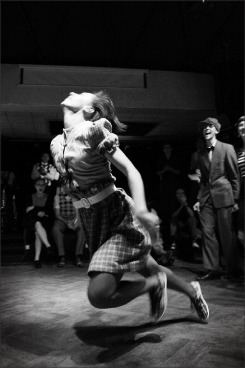
Nadia Gric’s photos from the Harlem dance fest in … Lithuania? … are AMAZING. I found them via faceplant, but you can see them on picasaweb. Do make sure you look through the stuff from other days of the festival. No one gives fabulous venues like those European countries.
I also really really really like this pic.
B210k: wk2, run2
distance: 7.86 km, time: 00:57, pace: 07:15, calories: 740, effort: 5/5
Slow runner is sloooooow.
sunny
kids and kultcha
I’m trying to keep track of interesting links.
First, ProgDinns have another great post up. This one’s about kids and food and kids as critics.
This post led me to the Mammalian diving reflex site. That’s where I read about the kids reviewing stuff at the festival, giving adults hair cuts and going to restaurants. I also read the stuff about the experts on aging.
Then I read the article about the kids doing the reviews and it was great.
Then I read the eat the street mowbray heights blog and then I read the eat the street toronto blog.
And finally I read the Childrens’ Choice Awards blog.
All of these things are just great.
gingerbread noms
This is a recipe I’ve used lots of times. I’ve tried the 2 Fat Ladies one, but this one is better. It’s from Vogue Entertaining Aug/Sep 1996. It’s from a special they did on ‘country cakes’, and every cake I’ve made from that collection has been really really good. I’m not very good at cakes, but this one is heavy and solid and is difficult to ruin.
Gingerbread
250g butter
1 cup sugar (I use a soft brown sugar)
1 cup treacle
2 eggs, beaten
1 cup milk
2 tsp bicarb soda
3 cups plain flour
1 tsp ground ginger (I replace this with fresh grated fresh ginger. In fact, I think the fresh ginger is the most important part. I use the youngest ginger I can find, and grate a heap of it – 2.5 big tablespoons. The amount you use should depend on the ginger’s freshness and age and your own taste. I like the cake really gingery, but not everyone does. Also, you might like to be careful about how finely you grate it. I like chunks of ginger, but it’s not for everyone)
1 tsp ground cinnamon
1 tsp ground nutmeg (as per usual, grate it freshly yourself and the difference will be amazing)
I also add 1/2 tsp ground cloves, 1/2 tsp ground mace, but these are quite aromatic and not really to everyone’s taste
Butter and flour the sides of a 23cm square cake tin and line the base with baking powder (this is a big cake, so I use my larger loaf tin). Preheat the oven to 180*C
Melt the butter in a saucepan with the sugar and treacle and set aside to cool.
Beat the eggs and milk together in a bowl and add the bicarb of soda, which has been dissolved in a little warm water.
Pour the egg mixture into the cooled treacle mixture. Sift the flour, ginger, cinnamon and nutmeg (and other spices – but perhaps don’t sift the grated ginger, just add it) together in a large bowl.
Make a well in the centre and pour in the egg mixture.
Mix well with a wooden spoon (I usually use the electric mixer here as I always find it hard to get the lumps out otherwise. But beating can make the cake a bit too light and fluffy, and while it settles a bit as it gets older, the fluffiness doesn’t really suit the cake).
Pour the mixture into the prepared tin and bake on the centre shelf of the oven for 45 minutes or until a skewer inserted into the centre of the cake comes out clean.
Remove from the oven, let stand for 1 to 2 minutes and turn the cake out onto a wire rack to cool.
The recipe says to serve it with whipped cream. But I like it spread with butter. It gets better if you leave it in a sealed container (or tied plastic bag) as the outside softens and gets stickier.
visualising information
We’ve only spent a tiny bit of time on this in class, but I’m interested in visualising information. Being a word person, I’ve always tended to represent information in words. But working on the MLX websites and programs I’ve also had to figure out ways of representing information in other ways. Dancers during an exchange aren’t interested in lots of words (and are often too tired to figure them out), and, frankly, who wants to read a whole bunch of long, boring sentences when there’s exciting action things to be done?
There are a range of accessibility issues at play here as well, and reading problems are quite common in dancers.
So here’re a few sites I’ve found that tackle this issue of ‘visualising information’
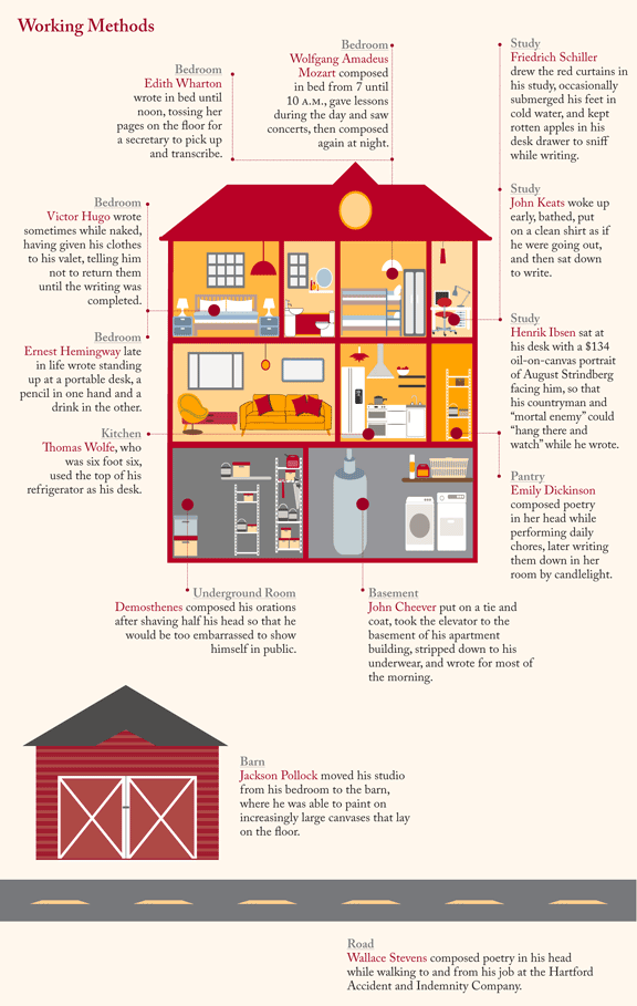
This one is taken from Lapham’s Quarterly, which is a really nice online magazine/journal dealing with history, literature, art – all that high brow action. But the tone is cheery and a little wiggedy, and they tweet some really cool stuff.

This American Infographic features “infographical companions to the celebrated radio show”. In other words, it is a series of images created in response to episodes of the This American Life radio show.
There is, of course Edwarde Tufte, king of visualising information. Tufte had a walk-on part in my last essay. With a line, I think.
Newsflow visualises news stories in real time, as they are published. This one is FULLY SICK.
Infosthetics is a blog capturing links to really interesting ‘info visualisation’ items.
textarc ‘visualises’ the words of books or text. This is magic.
We Feel Fine, visualising ‘I feel’ or ‘feeling’ text from blogs.
Visual Complexity is… well, lots of visual information stuff.
Edit: Something critiquing the ‘vizualisation cargo cult’.
Someone else getting cranky about dodgy info visualisation.
A tool for doing your own fancy visualisations.
Another Edit: Visual information and The Times through history.
B210K: wk2, run1
distance: 7.28 km, time: 00:57, pace: 07:50, calories: 740, effort: 5/5
Tired, now. It was a long run and I was puffing like crazy at the end.
Some arsehole in a 4wd yelled out his window at me for about a minute because I ran past him on a zebra crossing. This is the first time this has happened to me running rather than cycling.
I didn’t yell back, mostly because I was 2mins from home and puffed, but I kept thinking ‘wish he’d check his speedo for me – I bet I’m pwning this’.
Why do these sorts of arseholes think the worst insult they can yell at a woman is ‘fat cow’? Particularly when they’re _stitting_ in a car?
Motorists are fuckwits. I, however, am a running ninja. 7km _and_ I pwned the patriarchy. All in one run.
fitness: site-seeing cycling
distance: 18 km, calories: 508, feeling: good, effort: 3/5
Easy, slow riding as we were site-seeing around the wetlands.
My knees have been sore with the running (and dancing), so hard peddling hurt, but otherwise the low impact exercise was GREAT.
tasty world
8track: strings and clapping for running
Image from shorpy, though I almost went with this.
I actually listen to the songs in the following order. That way they start mellow and get crazier, so I can wake up gently, then get my arse kicked a bit when I start to lag later on.
Thulandivile (Keep Quiet I’ve Heard You) Elite Swingers Natural Jazz 131 2:39
Dinah Preservation Hall Preservation Hall Hot 4 With Duke Dejan 154 2004 5:01
Eh la bas Preservation Hall Jazz Band Shake That Thing 191 2004 3:52
Baby (Darlin’) Baby Midnight Serenaders Sweet Nothin’s 243 2009 3:16
A Mug Of Ale Joe Venuti’s Blue Four All Star Jazz Quartets (disc 3) 220 1927 3:07
Coffee’s Cold/Tater Patch Uncle Earl Going to the Western Slope 254 2004 3:08
Double Check Stomp The Pasadena Roof Orchestra Rhythm Is Our Business! 228 1996 3:59
The Love Me Or Die C.W. Stoneking Jungle Blues 153 2008 3:55
El Pito (I’ll Never Go Back To Georgia) Joe Cuba Crooklyn: Vol. I 157 1966 5:33
If I Could Be With You One Hour Tonight Linnzi Zaorski and Delta Royale (Charlie Fardella, Robert Snow, Matt Rhody, Seva Venet, Chaz Leary) Hotsy-Totsy 129 2004 2:36
The Clapping Song Shirley Ellis Because Of Winn-Dixie (Original Motion Picture Soundtrack) 168 2005 3:11
Drinker Born Uncle Earl Waterloo, Tennessee 2007 3:22
Stay A Little Longer Bob Wills and his Texas Playboys The Tiffany Transcriptions (vol 2) 232 3:07
Some of These Days Midnight Serenaders Sweet Nothin’s 255 2009 3:29
El Panadero Cheba Massolo Coyazz 202 2008 2:32
B210k: week1, run2
distance: 6.39 km, time: 00:53, pace: 08:18, calories: 688, effort: 5/5
Man, it kicked it my arse. But it was good and I didn’t stop running in the running bits. Running later in the day to avoid the rain meant running in the heat and humidity and I SWEATED so much.
Some aches in my bad foot – makes me think I should revisit the podiatrist to have my orthotics checked (it’s been a year).
My shins were a bit achey before I started. I don’t do any warm up stretches, but lots of warm down stretches. I think I need to do proper warm ups, beyond the 5minutes walk.
sunny
