The Average Person Spends 27 Seconds Looking at a Work of Art. Now, 166 Museums Are Joining Forces to Ask You to Slow Down
Museums in Australia, Canada, the UK, the US, and elsewhere are holding special events for Slow Art Day on April 6.
….
Founded in 2009 by Phil Terry, the CEO of the consulting firm Creative Good, Slow Art Day asks museum-goers to spend ten minutes looking at a single work of art, focusing intently on the piece before them. The initiative is “counter-cultural to the smartphone and its growing dominance in culture, but also to blockbuster exhibits and the focus on absolute numbers,” (Slow Art Day)
I like to enjoy art in lots of different ways, depending on how I feel or where I am. Sometimes slow, sometimes fast. This idea that we have to look at art in one way (slow) is poop. Because it excludes those of us with little time, or kiddies on hand, or with special needs, etc etc etc. And some pieces of art want us to look quickly, to let our eye move. Even Warhol would probably have liked it most if we barely glanced at his soup cans as we walked past.
I do a lot of gallery and museum looking when I travel, and I’m super picky. I never ever need to see another Brett Whitely, and I’m a bit tired of Warhol (which he’d probably like). Good curating makes a collection lookable. I like a well-curated exhibit, but I can also take more time in a truly terrible exhibit bitching about the shocking layout, impenetrable text, or confusing space (eg I reckon that street photography exhibit at the Sydney Museum is woeful, when the subject matter is fascinating).
I’m a big fan of exhibitions that have pieces ‘in conversation’ with other pieces, or that involve the gallery itself in the exhibit. Rather than a featureless white wall that fades into the background, I like a gallery that speaks to us, that asks us to think about where we are, as well as what we are looking at.


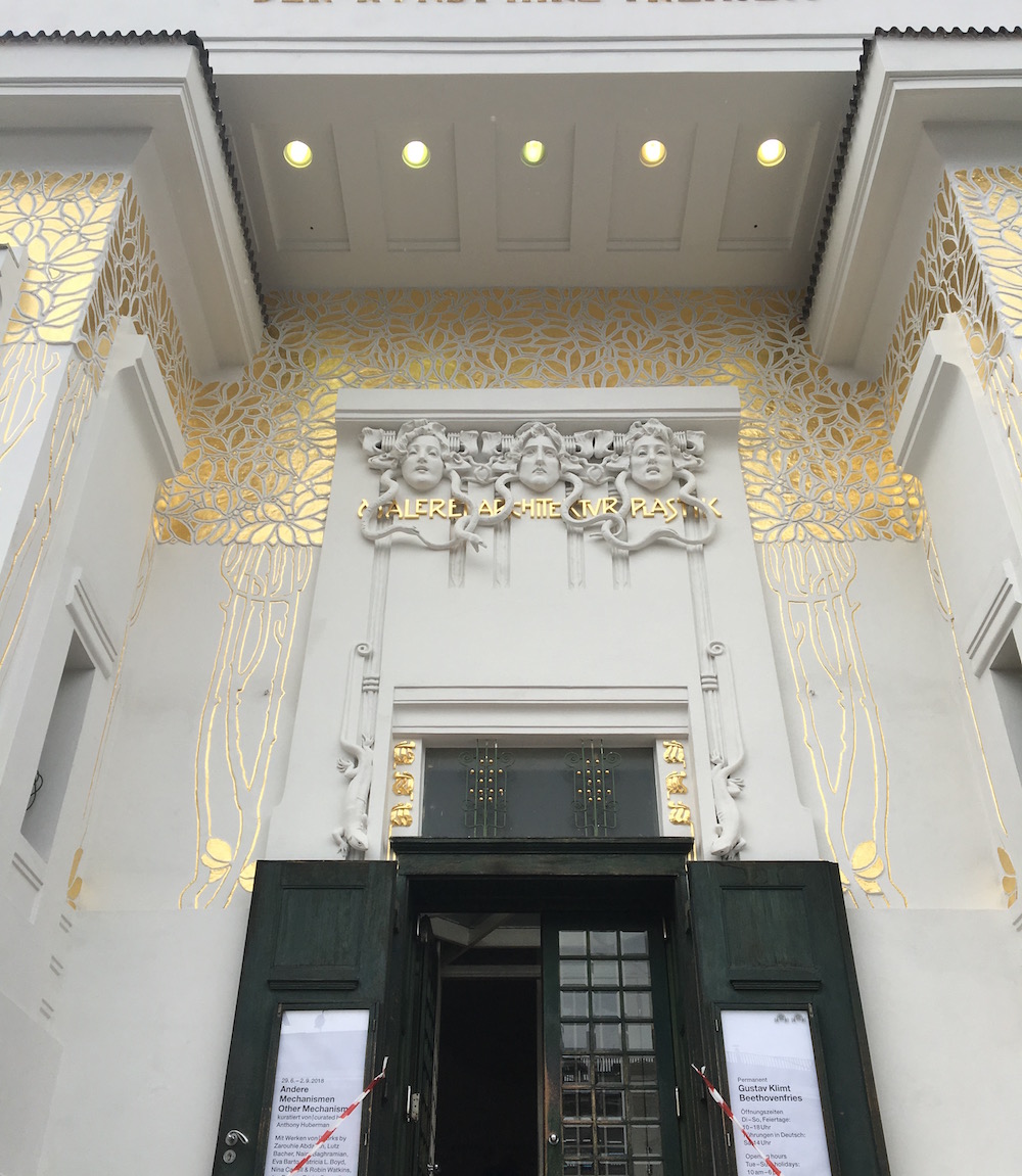
The Secession building in Vienna is one of those places that asks us to think about the place of art in space (a building), a city (Vienna, wealthy European city, home to zillions of galleries and museums), a culture. The building is beyond beautiful, and home to the gorgeous Klimt Beethoven frieze. The Secession movement, though, was about freedom. To quote our friend wikipedia,
Secession artists were concerned, above all else, with the possibilities of art outside the confines of academic tradition.
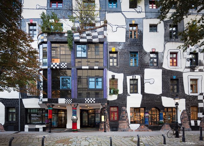
They physically got themselves and their art up and out of the Vienna Künstlerhaus. But just walking past this incredible building – far smaller than the many of the galleries and museums all through the city – is exciting and inspiring.


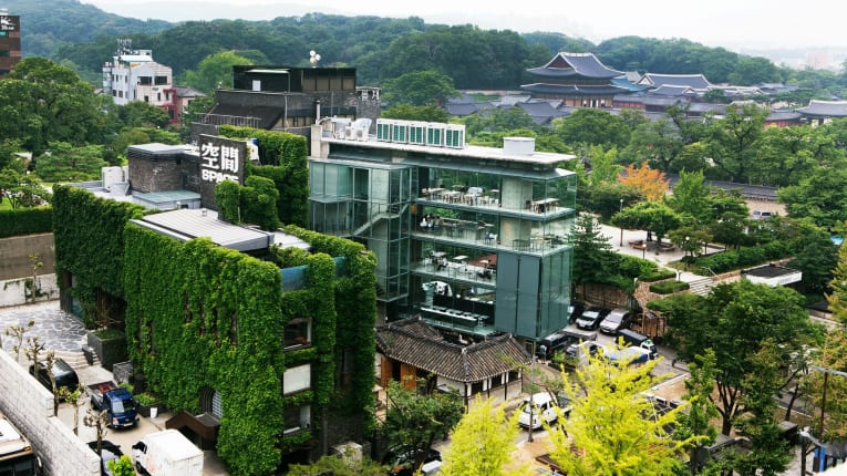
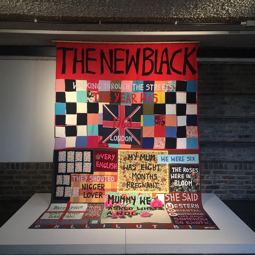
I saw a great exhibit of contemporary radical British art (lots of black British art, feminist British art, etc) in Arario at Space in Seoul which was really cool because it was mostly 80s art* in a 1970s office building which was itself a comment on community and space. It was truly mesmerising and engaging. The building’s architect, Kim Swoo-geun, was making clear comments on the role of community, shared work, national identity v local identity, and shared space. The art, of course, was commenting on 70s and 80s Britain, and locating cultural space and identity as black and women artists in a colonial empire. Also there was swearing and many fucks thrown in Thatcher’s direction.


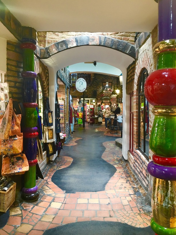
Similarly, I loved the Hundertvasser Haus in Vienna for the relationship between art and space.


For me, it’s not so much about individual pieces, but about the relationship between the pieces in a room, or a space. And that means having places to sit, to take selfies with pieces, to try a statue’s pose, to walk back and forth comparing pieces, to stop and peer at a bunch of tiny things in a case, etc etc etc.
I like a well thought out bit of text with useful information, and I’m a massive fan of exhibits combining different media (eg costume with paintings with prints with drawings…)


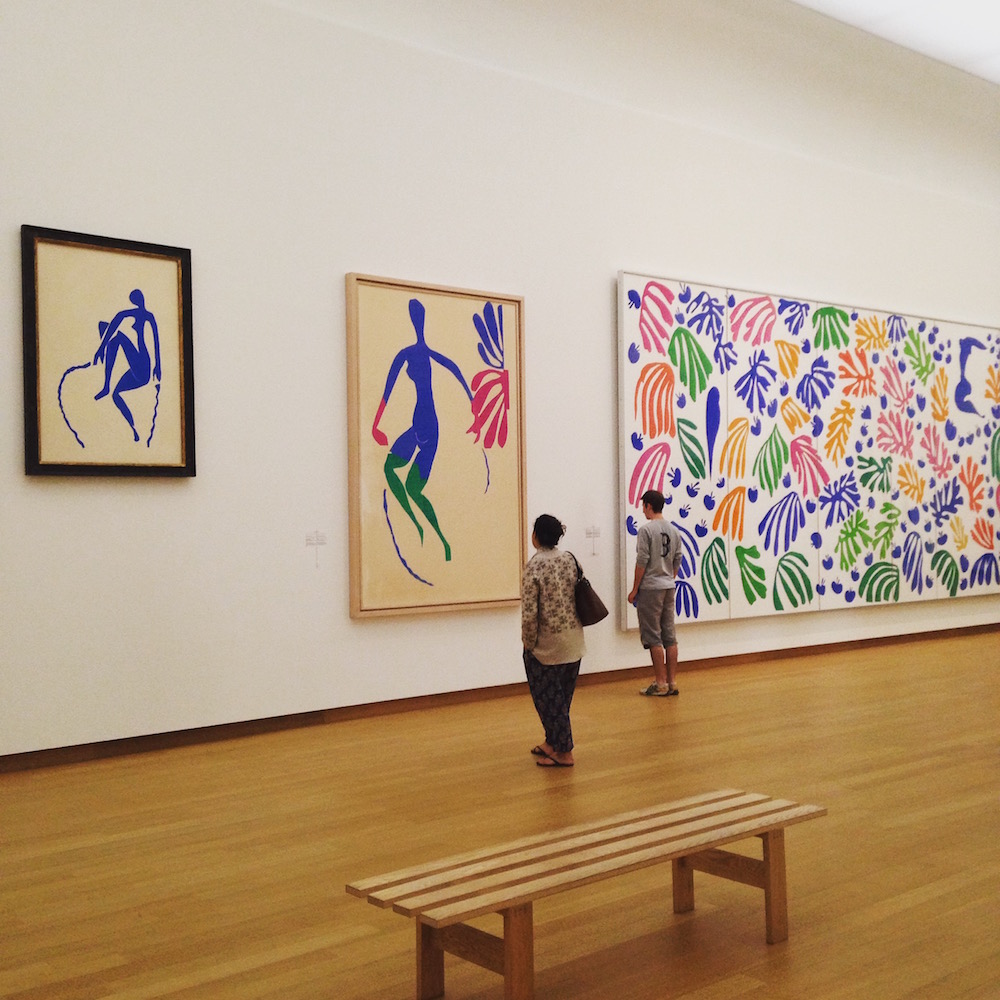
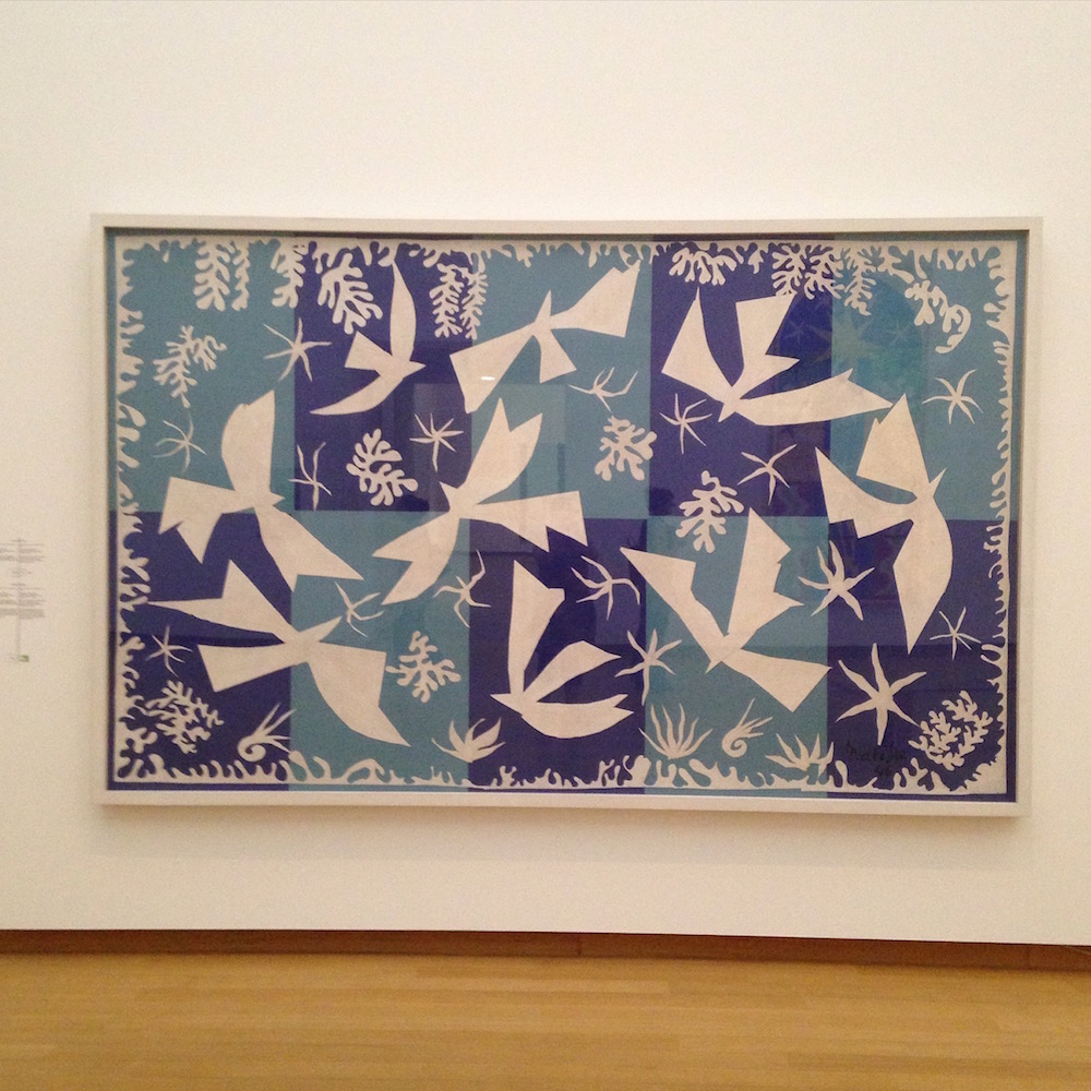
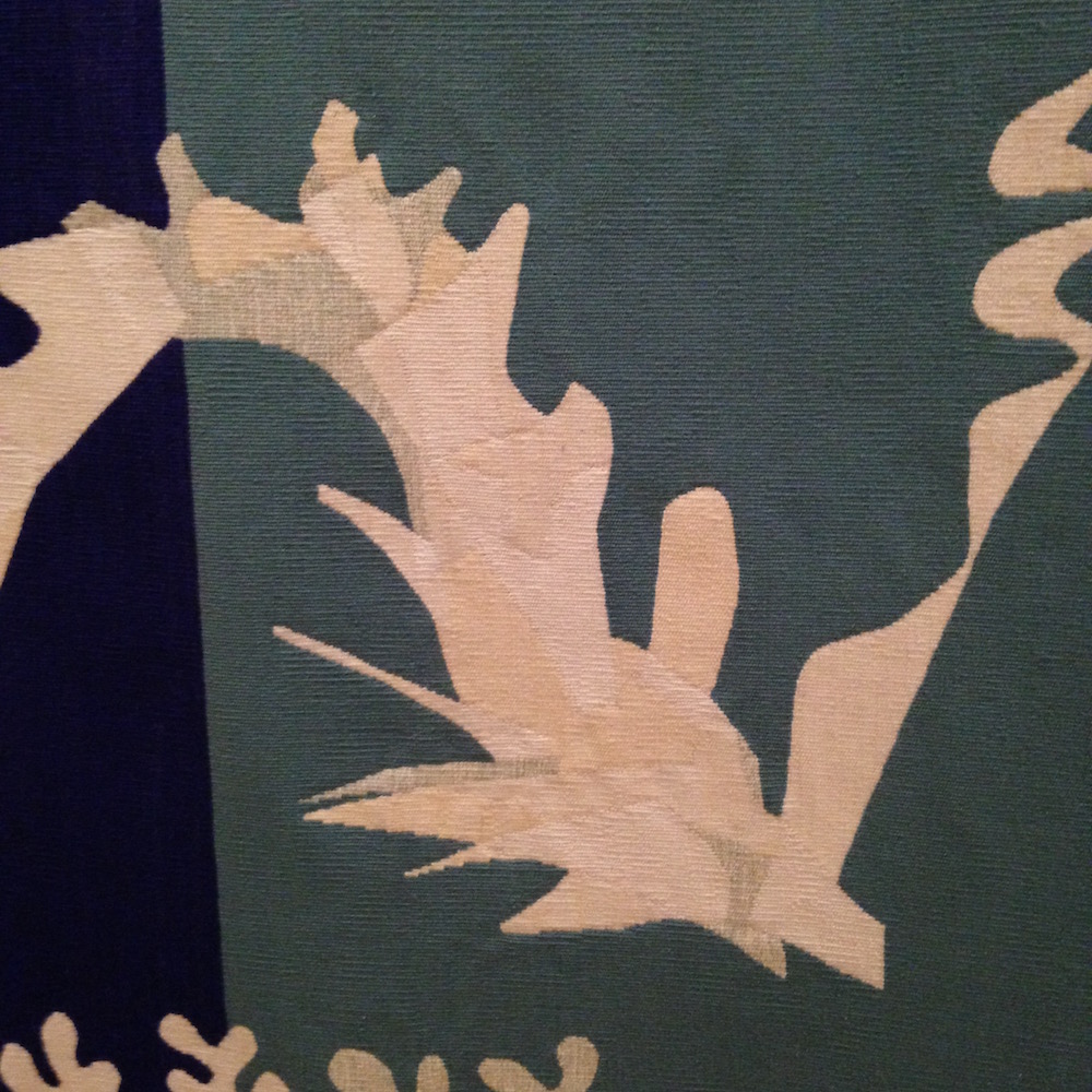
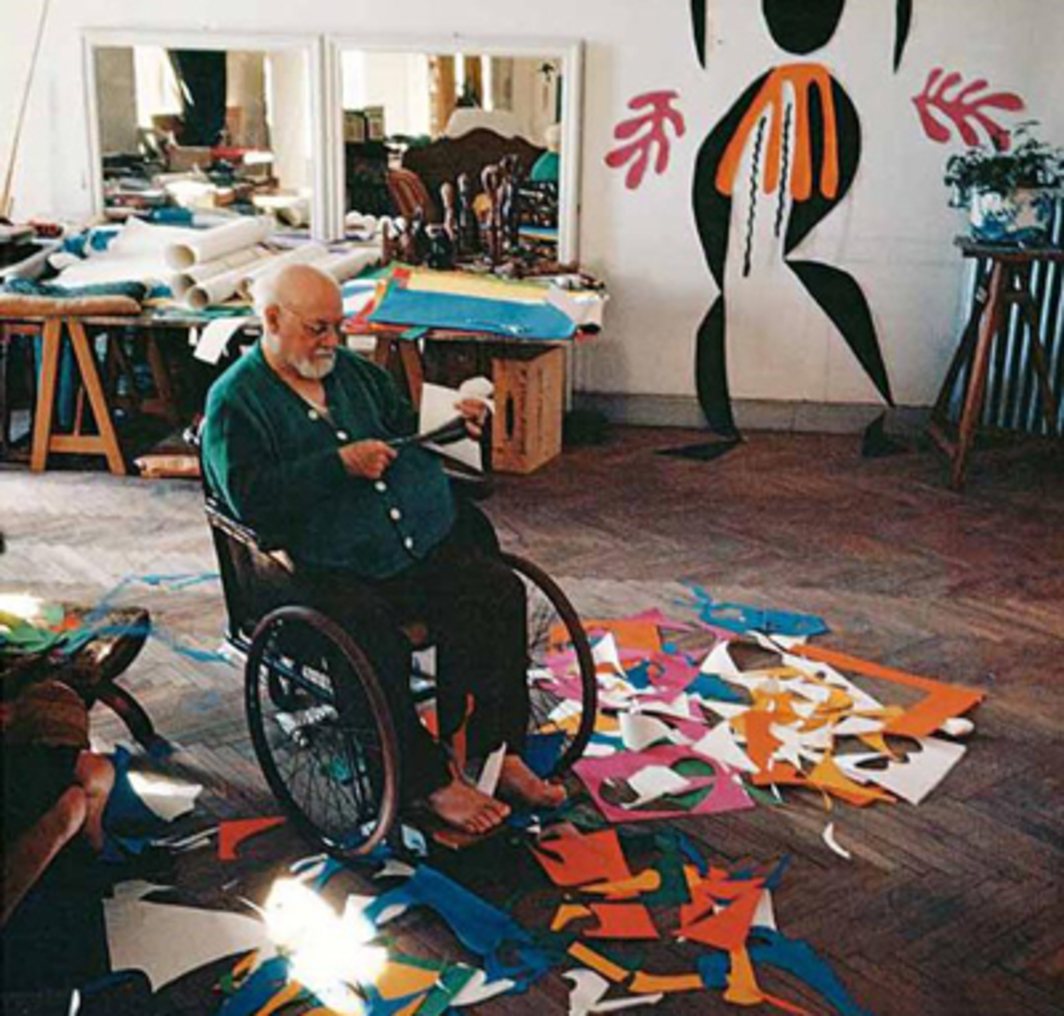
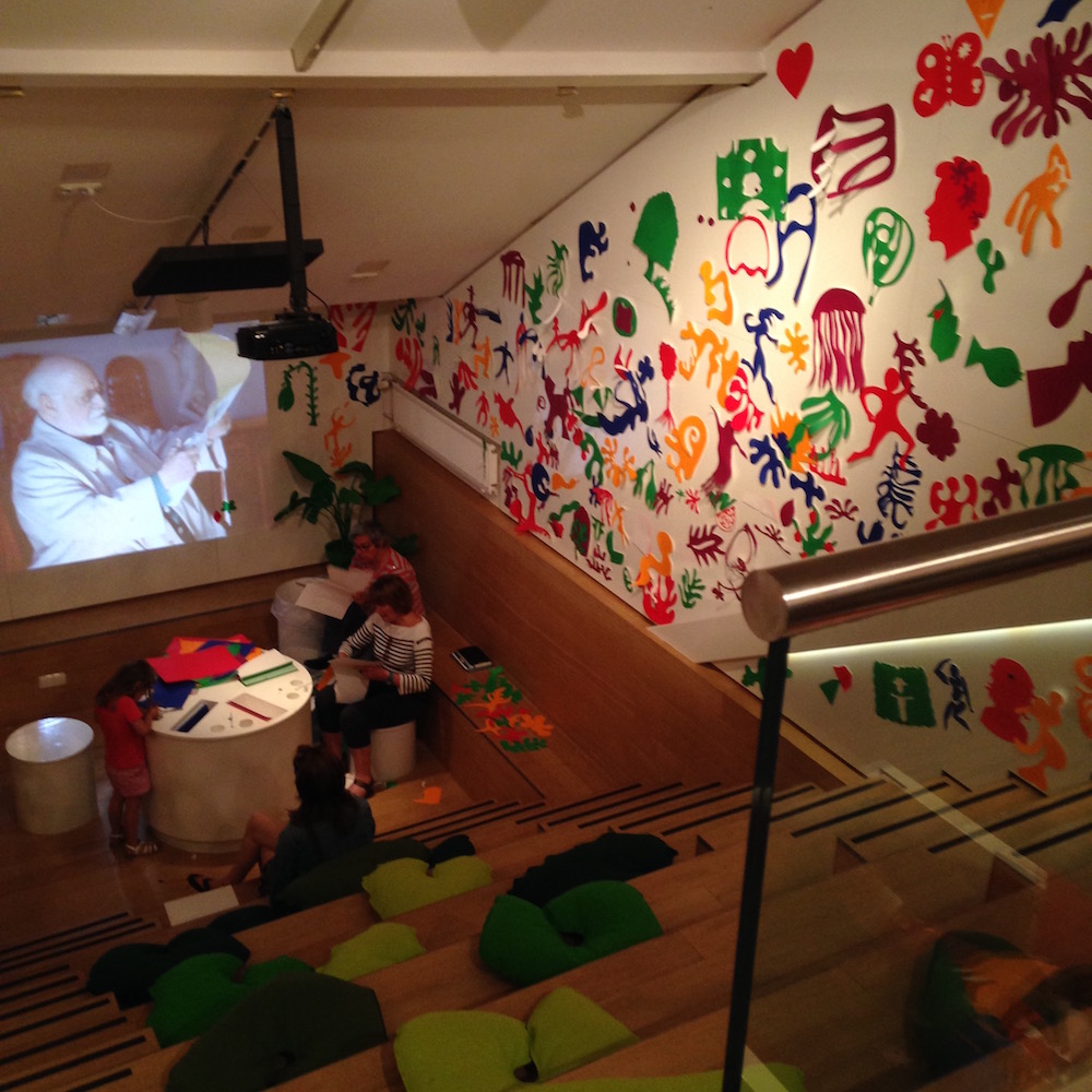
I saw a fabulous one of the Matisse cut outs at the Stedelijk which was in an interesting building, and used the concept of the cut outs in a fantastic way: we saw the pieces, we saw huge rooms dominated by huge colourful pieces, we saw tapestries inspired by them, we got to cut out our own and stick them up on the wall, we see films about the process, etc etc etc. It was just magical.

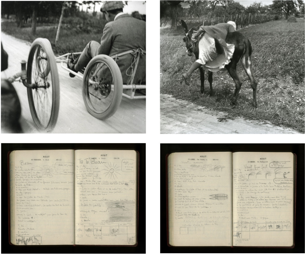
Years ago I saw an exhibit of a Lartigue’s journals (photos, notes, drawings, etc) in a British gallery (I think it was the Lartigue: album of a century exhibit at the Hayward in 2004)? It was just one room, but I spent HOURS there, pouring over the pages and photos. It wasn’t even hugely interesting in layout: they just had the journals open at pages and bigger prints of the images. But it was the subject material that made it so cool. It was so memorable that when I saw a tiny exhibit of his photos in Seoul years later, I was overcome by the feels.
Sometimes, though, I do like to stop and stare at one piece for ages.

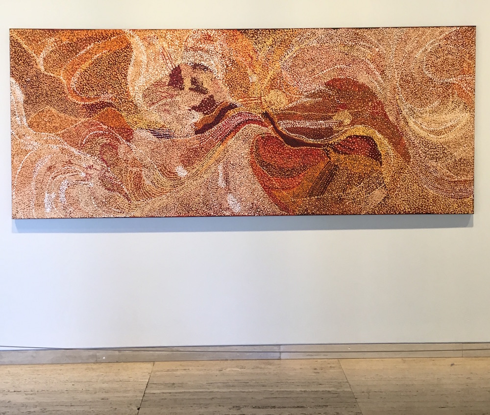
I’ve been caught and stopped dead by some of the massive big pieces in the entrance way of the AGNSW lately. There was a fantastic, mindblowing series of huge canvases of Indigenous Art there last year that just stopped me in my tracks. They were so incredible, just on their own, that I had to stop and stare. For them, it was the sheer size and colour in a space that is functional – you walk through it to get to everything. They didn’t need anything more than to just be there, huge and bright and complex and wonderful, in a white, utilitarian space.

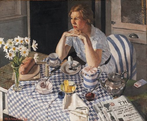
I occasionally stop in to see my favourite lady at breakfast picture at the AGNSW. Sometimes we do just want to sit and look at one piece for ages.
*This is ‘The New Black’ by Tracy Emin, 2002. Appliqué blanket. Emin’s most famous work is ‘Everyone ‘ which appeared in Saatchi’s exhibition of Young British Artists‘ work, ‘Sensation’ in 1997. YBA were ‘shocking’ young artists, and the exhibit included Emin’s work Everyone I Have Ever Slept With 1963–1995.


