To help myself remember where these useful posts are:
Feminists are sexist?
Catherine Redfern answers in her 2003 piece ‘Feminists are Sexist’: Should feminists have to spend exactly half their time, energy, and resources working on behalf of men to be taken seriously? Catherine Redfern thinks not.
…sadly, this “improving women’s lives is sexist” attitude reflects part of the wider mainstream fear of feminism. It’s why people say things like ‘I’m not a feminist, I’m a humanist’ or ‘I’m not a feminist, I’m in favour of human rights’. It’s because there is a stigma attached to any activism that unashamedly benefits women, as a social group. It’s not seen as worthy enough, and fighting on behalf of women as a group is embarassing somehow. I’m just talking about plain, uncontroversial activism that improves the lives of women.
I do feel as though many of the people reading my blog simply don’t have a working understanding (or even a basic understanding) of the central tenets of feminism. There are lots of places to find out about this stuff, so it’s really in your interests to do a little research before you wade into a feminist debate. I mean, just banging on about ‘reverse sexism’ makes you look like a fool. The best place to start is with Feminism 101. I’m also quite fond of Thinking Girl’s brief overview of key terms in feminist thinking.
The bit about oppression is useful in dismissing this ‘reverse sexism’ bullshit:
Something else that is important to understand is that oppression is not discrimination. Oppression is about systems and relations of power, and exists in social structures and institutions. Oppression is wide-spread subjugation of one group while simultaneously privileging another group. This means that those groups who are subjected to oppression are not in a social position to oppress people belonging to the dominant group. There is no such thing as “reverse” sexism, racism, homophobia, (dis)ableism, classism, etc.
Basically, ‘sexism’ is an articulation or demonstration of power. So it’s something that people with power get to do. In the context of gender and sex, patriarchy (which organises our societies) robs women and girls of power. So when a woman* calls you or your friend out on your dodgy thinking or behaviour, she isn’t speaking from a position of power. She’s actually taking a bit of a risk, and she’s speaking against the grain. In this sense, feminism is activism because it is critiquing the dominant social order.
Conservative media and politicians might bang on about ‘political correctness’** and argue that feminists are oppressing them, but this is patently untrue. If you take a quick look at the stats, you’ll see that most property is owned by men, the highest wages are earned by men, women are more likely to be sexually assaulted, most positions of power (political, economic, industrial, religious…) are occupied by men. So, yeah, feminism. Not really fucking over the patriarchy just yet.
*This is why I think it means something quite different for men to speak out about sexism and misogyny. I’m not sure how I feel about the idea of ‘male feminists’. I much prefer the concept of ‘feminist allies’, because I think that one of the most important parts of emancipation and social power is being able to speak up for yourself – to represent your own ideas and self in public discourse. And while I love and adore and admire men who speak up for feminism and feminist projects, I think it means something quite different when a woman is standing up. The concept ‘feminist allies’ excites me. It tells me that men are ok with working with women; they don’t need to lead the charge.
This topic is quite fraught, and one that many feminists disagree about. So my opinion is just one among many. And of course, when you start talking about gender identity, transgender identity, and so on, this distinction between ‘men’ and ‘women’ stops being useful. I haven’t done a lot of thinking about this, though I SHOULD.
**I do recommend reading up about the history of the term ‘politically correct’. The Wikipedia page is surprisingly useful. Basically, the people who use the term ‘politically correct’ are usually people who don’t like the idea of feminism or socialism or other actions or movements which are interested in equity and social justice. Not too many feminists use the term. I don’t use it because it’s just not useful: it implies that there’s just one way of pursuing social justice, when of course feminism is about diversity and plurality of approaches and thinking.
taun tuan
Watching Empire Strikes Back. Again.
A manifesto should upset and excite. It is revolution, not reassurance.
This is another post I wrote ages ago, but didn’t bother posting it because I’m feeling pretty paranoid about the nasty responses my ‘feminist’ posts get. As though any post I write could not be feminist.
Anyways, a quick timeline: I first read about Frumious Bandersnatch’s post ‘A Feminist Lead’s Manifesto’ via Lindy Hop Variation’s For Followers’ post ‘Reactions to the female lead’s manifesto’. I read that post and thought ‘aw yeah, whatevs.’
Then I read the actual manifesto (which an awful lot of people on Faceplant didn’t seem capable of doing – they just waded into that response piece, instead of actually reading the original manifesto. I facepalm and I facepalm.)
I read it and thought ‘cool, a manifesto’. But I didn’t have time to reply, because I was busy being a female lead, a teacher, an event manager, etc etc etc. Too busy fighting the patriarchy to write about fighting the patriarchy.
This draws me to a discussion of the role of women’s studies as critical thinking vs feminism as activism. I remember an essay Nancy Fraser wrote about the importance of activism to feminism, arguing that theory is important, but the essential nature of feminism is to enact or work for social change. So, in other words, just talking and thinking and writing about it isn’t enough. I’ve just spent ten minutes trying to find the reference to the article, partly because there are some problems with Fraser’s position (or, more likely, of the way I remember that position), but I can’t find it. GODDAMM it. Anyways, the general point was/is that while theory and discussion is very important to feminism, activism – actually doing things is far more important. You can of course argue that thinking and talking about things does constitute activism (particularly in regards to language and power, but Fraser has things to say about structuralism and linguistics which I can’t go into here).
I’d argue that writing and talking about dance is important. The mediated experience of dance (particularly in terms of youtube videos reframing actual dancing) can be just as powerful – and is probably more pervasive for most people who don’t dance every day – than the actual dance act. But I feel, quite strongly, that talking about dance, eventually, has to give way to dance itself in terms of actual authority. In other words, it ain’t what you say about lindy hop, it’s the way that you do it that counts.
In my experience, if I really want to change things in the lindy hop community, I need to get out there and do it. Less talk, more action. The best way to get more women leads on the floor is to have women leads on the floor. And we gotta start somewhere. Someone has to be that first woman out there on the dance floor, leading. And fuck, I’m ok with being that first person (I took up this point in greater detail in I vant to be alone and lindy hop followers bring themSELVES to the dance; lindy hop leaders value this).
I do also think that it’s important to encourage other women to lead. That can mean just cheering when they’re rocking something on the social floor, asking them to dance yourself, or it can mean saying things like “Fuck, yeah, just get out there and have a bash” directly to them. And you don’t need to use activist or political rhetoric in this sort of encouragement. Really, leading is fun – so encouraging other people to have fun isn’t really a difficult project.
Despite this commitment to actions, I still think it’s important to think about things and to write about them. Because critical engagement with a topic is important. Off the dance floor, we have time to think about things, and to look for connections. We can look for the way systemic disempowerment – patriarchy – works. This is the nature of patriarchy: it is a complex system of actions and institutions and discourses and face to face activities.
If I feel so strongly about the importance of thinking and writing about gender and dance, why haven’t I written much lately, in a concentrated way?
- I get hate mail. And I just got tired of it, especially after that boob post. And I noticed that Parrot Cat and Lindy Shopper haven’t talked about it much either.
- This makes me ANGRY because it shows how attacking women keeps them quiet. It also ‘proves’ the bullshit idea that ‘being in public wearing an opinion’ is ‘dangerous’ for women. When, really, that’s bullshit. It’s no safer keeping quiet and not saying anything. All those attacks on those public women? They were attacks on all women, telling them to shut their mouths.
I have to pause here for a diversion. But it’s a relevant one. I have to talk about the current Australian political climate (Edit: here is a list of articles with more information). When the ‘Female Lead’s Manifesto’ was written, the first woman prime minister of Australia was the target of a sustained, furious hate campaign by the mainstream press and conservative politics, which eventually resulted in her being ousted from the leadership of the ALP (and hence the prime ministership). Anne Summers has written lots of interesting things about this, and I’ve heard Kerry-Anne Walsh’s book ‘The Stalking of Julia Gillard’ is a good overview of this whole issue.
If you’re a person with even half a brain, you’ll be furious about the way Gillard was treated, whether you agree with her actual policies or not. The misogyny, the hatred has been palpable. It’s been a scary time to be a woman in Australia.
So let’s return to the Female Lead’s Manifesto. The author is Australian, and I think that you’d have to have no media contact whatsoever to have missed the horrid shit happening our media sphere. So this manifesto was written in a particular moment in Australian political and social history. Let me spell it out for you: if you were living in Australia, consuming Australian media, you would have clearly received the message that ‘women leaders are fucked up, bad, and awful.’ …not that this is unique for women leaders in any patriarchal country.
Do I go too far in reading lindy hop ‘leads’ as ‘leaders’ in the same way that a PM is a leader? No. No. No. Leaders decide policy, followers enact that policy. The lead is the PM, the follower is the government. Two different types of power. It is a fairly stretched point, but I think the theory is the same: there is a sense in both dance and political discourse, that the ‘natural’ state of things is for men to lead and women to follow. Hence the resistance to using gender neutral language in dance classes: it is as though teachers cannot even imagine that women can be competent, serious, focussed leaders. So language needn’t change to reflect this idea: that women lead.
Let’s get specific. How did I feel about the Female Lead’s Manifesto? Generally, I thought ‘ah, this is a manifesto. It is a personal statement of intent. It is for this woman, to rally her reserves. It’s not exactly as I would have written it. But then, it’s not my manifesto.’
Faced with the creeping, dragging weight of patriarchy in dance, we all need a little pick me up now and then. So even though it’s not my manifesto, I’m still excited by it. It lifts the spirits.
Let me really get into it, now:
Frumious Bandersnatch makes this clear at the beginning:
Fuck the heterosexist patriarchy, I’m a female lead and I’m not making excuses for it. This post is not a list of reasons to validate the existence of females leads, this is a manifesto.
Yes. This is thrilling. I am not making excuses. I am not validating. I am telling you HOW IT IS.
This is exciting. For a woman to simply state, with no prevarication or excuses, how she feels, is exciting. And for this statement to be such a rallying call! Such a provocation! She’s not apologising for having ideas! She is DECLARING!
This is what a manifesto should do. It is a declaration of ideas and intent. This is HER declaration of HER ideas and HER intent. Speaking it makes it so.
The second part is more challenging. This is the really provocative part:
This manifesto starts with the premise that most leads are men and most followers are women. When we first start dancing we are usually not given a functional choice – even if we are told that women can be leads, we see that the vast majority of women are followers. There is overwhelming pressure for us to be followers too, especially when we’re new and just beginning. I will even go so far to say that all female leads know how to follow to some degree.
How exciting! Yes, I agree with the first sentence. And the second. Not the third – I know women leads here in Sydney who don’t follow, can’t follow, will NOT follow. This is hardcore. I am so impressed, so envious. They are much fiercer than I am. Much stronger in their convictions. This is exciting.
…but here is where I need to pause. What does it matter that I agree or I disagree? This is not a call for discourse, or an invitation to conversation. This is a MANIFESTO. In this piece, the author is REMAKING THE WORLD. How exciting!
Why don’t I just play along? Why don’t I just accept it as read, that women are better leads than men? Why can’t I just pretend. Or at least accept the premise of this scenario. What would the world look like?
IMAGINE:
a world where women lead better, more, than men.
Imagine a world where most cops are women, most judges, most politicians. IMAGINE!1! It’s just so exciting, just so revolutionary and destabilising a thought. And it’s exciting because it is so far from my lived reality. It will not happen in my lifetime. And that is why it is exciting: it is forbidden, unlikely, subversive, transgressive, revolutionary. REVOLUTIONARY.
And that is because the inverse is true.
I don’t think most men stop and think… heck, most women don’t stop and think about the fact that most positions of power are occupied by men in our society. No, biology has nothing to do with it. My uterus is not preventing me from running the world.
Now, here’s a truly radical thing: gender switch the main characters in CSI. Of your news readers. Of your school teachers. Of your bus drivers. Imagine! Just the thought is making me giddy. Everywhere: women being and being portrayed as publicly capable and competent, and more important – being respected and treated as capable and competent! FUCK!
Now, pause. If you’re Swedish or Danish or generally from a more progressive country, this won’t rock your world. But here, in my country, this is our first woman national leader. This is amazing. AMAZING. This has NEVER HAPPENED BEFORE, in two hundred years of white history. This is THE FIRST TIME a woman has been the leader of my country. Finally, there’s someone like me being powerful and competent in public.
So when the Female Lead’s Manifesto is written, it is saying, not ‘imagine’, but IT IS SO. Who are we to disagree? How do we know this isn’t true? Sure, you might have anecdotal evidence to the contrary, but what if it’s true generally? This is mind-blowing thought. And why not – why can’t we just accept this? Why can’t we imagine the impossible, the improbable, the unlikely? If it feels revolutionary to imagine half the women in your scene leading, then how revolutionary is it to imagine ALL of them leading, and being BETTER at it than men! It’s mind-blowing!
And if you won’t – why not? If you can’t – what’s wrong with you? Why can’t you imagine women being better than men? Can’t you let go of your assumptions about gender, that somehow men are always going to be better? Every day patriarchy asks us to accept that all men are better leaders than women, that more men lead than women. And even though most of the time we have no clear statistical evidence to support this claim, we just accept it.
I’m not saying we have to enact this gender switch. Or even believe it. But why can’t we just imagine women this way? What does this imagining do to the way we see the world? This make-believe stretches our brains. It broadens our horizons. We’re jazz dances. We do the impossible every day! We create the amazing every time we move! Jazz dance is ALL ABOUT revolution and radicalism! So what’s stopping us?
Because, every single day, we are expected to accept that a woman can’t be as good a prime minister as a man. That a woman can’t lead as well as a man. That a woman can’t run a business as well as a man. Every single day, every moment of my life, I’m being told – by everything around me – that I am not as good as a man at leading. And I’m supposed to just accept this and treat it as normal. EVERY SINGLE DAY I am being treated by everything around me as though I am an object to be ogled, there for the desires of any man who may want me. EVERY SINGLE DAY I am being told that I am in danger, and that it is my own fault. EVERY SINGLE DAY my leading on the social dance floor or as a teacher or in competitions is made unusual, remarkable, strange, unusual, radical, unnatural. And I’m not even running a bus, let alone a whole country! If I can’t be trusted with these decisions, how can I be trusted with the whole country?!
So what I want to know, is not whether you agree with the Female Lead’s Manifesto, but WHY aren’t you furious about the fact that I am being told – all the time, by everything around me – that this Manifesto is a lie? That ONLY men can lead?! And that ALL men are necessarily better leads than women!?
WHY aren’t you jumping to your feet in rage when people tell you this?
My question is not “why are you angry about the Female Lead’s Manifesto, but why ARE YOU NOT angry EVERY DAY about the things that women are told by our culture?” If you can’t imagine that a woman can do one part of a dance, how can you possibly begin to imagine that a woman could be prime minister or drive a tank or perform surgery?!
Just as importantly, why AREN’T you enraged that men make up so few of our follows? What’s wrong with following? Why don’t you want it as badly as you want leading?
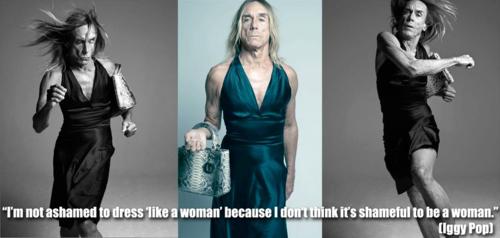
Apparently men are supposed to be ok with the idea that they shouldn’t want to follow/wear a dress/be associated in any way with femininity.
Finally, I need to tackle just one piece the ocean of stupid that flowed after the Female Lead’s Manifesto. Someone asked about the piece (inevitably, stupidly, painfully), “Isn’t that sexist?” and I’ve heard a variant “Isn’t that reverse sexism?”
No, friends, this isn’t sexism. You must remember: we are not starting from a level playing field. We are living within patriarchy, where everything is loaded in favour of a select special interests group within our community: white, heterosexual, middle class, able bodied men. This minority holds the majority of power, of money, of resources, of public space, of media space. Sexism is dependent upon context. It is a relationship of relative power. I don’t have time to spell it all out for you, so I’ll just redirect you to Feminism 101, where someone with more patience explains things to you.
The most annoying part of patriarchy is that it has convinced you – us – that this is normal. That it is an inevitable consequence of biology or divine intention. That women are not 51% of lindy hop leaders because we have a uterus or too little testosterone or too little body hair.
Understand this (for this is how it is): women are not 51% of lindy hop leaders because some fuck has told us we’re not capable of it. Some fuck has made it harder for us to lead than to follow. Someone has made it easier for us to follow and for men to lead. I am being deliberate about intentionality here. Don’t just accept that ‘society makes it so’ or that the reasons are ‘too complicated’. My being afraid to post a comment on gender in dance isn’t complicated. It’s fucking simple. IT IS SIMPLE.
So you need to look at simple solutions. YOU. Assume that there are things that you can do, and that these aren’t complicated. Start small. Start with things YOU can do.
So ask yourself: are you that person telling women they can’t lead? When you stand up in front of a dance class, are you making it easier for women to follow and men to lead? Gender neutral language is such a tiny, small thing. Why haven’t you taken it up? What’s wrong with you? You’re a fucking JAZZ DANCER, man, of COURSE you can use gender neutral language!. I mean, there are a million other things you could be doing to improve the ratio of female:male leads in your scene. Who rotates in your classes – leads or follows? How many female leads do you have teaching? How often do you reference women dancers when you talk about dance history? Do you know who Norma Miller is? Do you stop yourself saying things like “It’s traditional for women to follow and men to lead?” If you don’t, what’s wrong with you – that statement is untrue!
What are you doing to make your lindy hop scene a more interesting place? Remember, if only 0.4% of your women dancers are leads, then you are robbing your scene of the other 99.6% of women who may consider taking up leading. Not every woman might want to lead. But why not assume that every woman can lead? That every woman is potentially a better lead than every other man?
You know, that if women have this, if men have this – this one point of rebellion of self-worth and power – they are putting just one more pebble onto that bridge. They are one step closer to fucking the patriarchy. It will give them the confidence to do things, to be things, to imagine themselves as more, better, bigger, the best.
If that is the case, then, what are you doing to make it possible for women to take up leading?
Assume that, despite your best efforts, you only get 50% of your women leading. Isn’t that a real triumph?
WHAT are you doing to improve things? What is your manifesto? WHY AREN’T YOU ANGRY?
Happy Birthday, Nikola Tesla
One day I will write another poem for Nikola Tesla. This is not that day.
Tomorrow is Tesla’s birthday. Happy birthday, mate.
Happy Birthday, Nikola Tesla,
inventor of alternating current,
unfortunately not
a pro-rock-n-roll wrestler,
but still: fully sick,
Nikola Tesla.
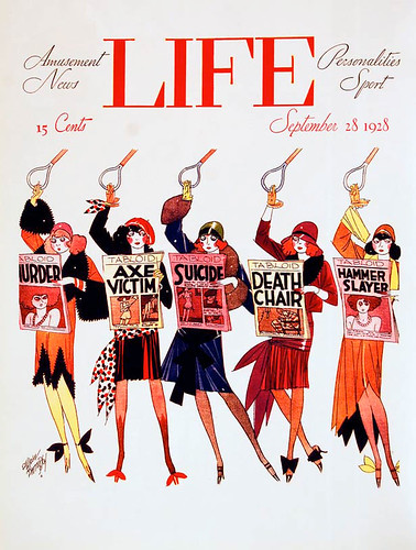
1928
beauty myth
Jazz lives talks about appearance and gender and jazz EARS TO HEAR WITH, EYES TO SEE WITH
dandylion
 (from silhouettemasterpiecetheatre)
Dance texts
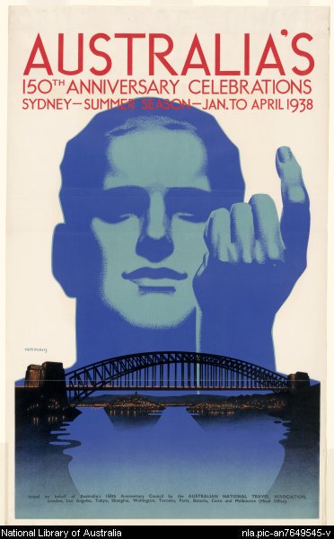
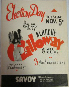
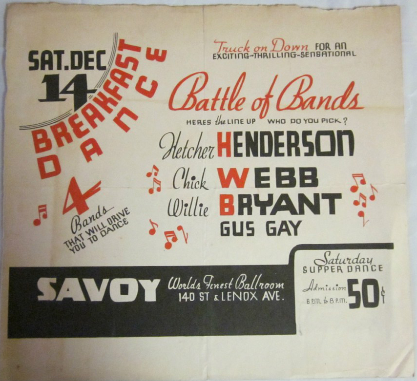
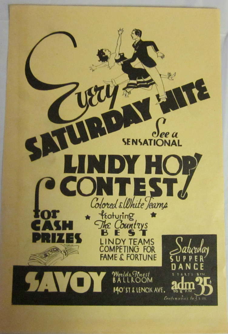
Looking into ideas for promoting events, I began with historical texts, for obvious reasons. I was caught by two examples: tourism posters for Australian cities and playbills/flyers for the Savoy Ballroom.
(1938 150th anniversary poster)
(Trove has a nice collection of these)
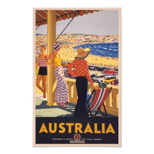
But I found the tourism posters just didn’t work for my project. I was designing a flyer for a local dance, targeting a local market. Tourism posters for Sydney were targeting a national, even international audience. The images of Sydney they offered were too simple: a sun-drenched beach. An art deco drawing of the Harbour Bridge. People who live in Sydney have a much deeper, more nuanced understanding of the city. Their idea of Sydney is far more than the Harbour Bridge or beaches. It’s street corners, shops, the view from a particular hill, the colour of the water near a park, the smell of the alley behind their house, the height of the steps from the train station platform. The tourism posters simply don’t capture that complexity of experience.
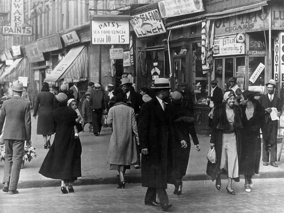
(from the npr site)
In contrast, the Savoy’s flyers perfectly capture a truly local idea. They’re hyper-local. Designed to be handed out, passed hand-to-hand, they’re designed not just for residents of a city, but for residents of Harlem. Of this part of Harlem. There’s no explanation of ‘Savoy’, or ‘lindy hop’, or of who band leaders are. There’s a great deal of assumed knowledge built into the creation of this text. Readers are positioned in a particular way.
Tourism, posters, in contrast, are introducing an idea of place to the reader. The Savoy’s flyers are using an idea of a place – a community – and expanding it with suggestions about how residents might enrich that understanding. You live in Harlem? Of course you care about dancing!
And an important part of this sense of hyper-local is the up-closeness, the immediacy of the physical object itself. This is a hand bill. A flyer. To be picked up from a table, accepted from a proffered hand. And then it’s folded and put in a pocket or bag. Slid into a newspaper. Tucked into a magazine or book. Scribbled on. Shown to, and passed from, friend to friend. And there are many copies of them.
Tourist posters are posters, displayed on walls. To be looked at, not used and possessed. In a similar way, the Savoy in these flyers is owned and belongs to local Harlem residents, and the Sydney of these posters is inaccessible – to be visited just for a day or week.
Flyers are cheap, one or two colours on cheap, small pieces of paper, mass-produced and replaced by next week’s – tomorrow’s – version.
This is fascinating when you think about how these local texts work in a modern context. While modern lindy hoppers rely on the internet – Faceplant, websites, email – paper flyers are still important promotional tools.
The thought is that you show an audience the image three times – in three different media – and then you have that image stuck in their minds. And paper flyers are found in dance spaces. These are powerful places for dancers, associated with the physicality of dance itself. But paper flyers only really work with the digital repetition. The winning trifecta is a paper flyer and a personal recommendation and a reliable website or email.
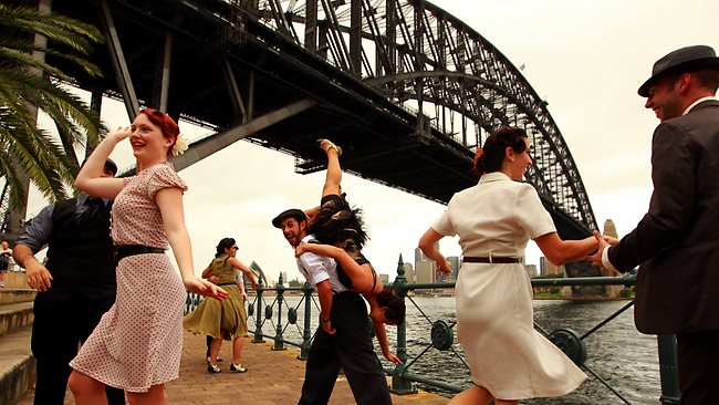
Looking at these two different media, I’m struck by how the Savoy’s flyers are perfect for promoting local dances to dancers. Because that is their purpose. A tourism poster, though, combining (for example), the Harbour Bridge with a dancer would be perfect for advertising a Sydney lindy exchange to interstaters or internationals.
(This photo from the RTA’s Sydney Harbour Bridge 80th birthday event gives us an idea of how this could work)
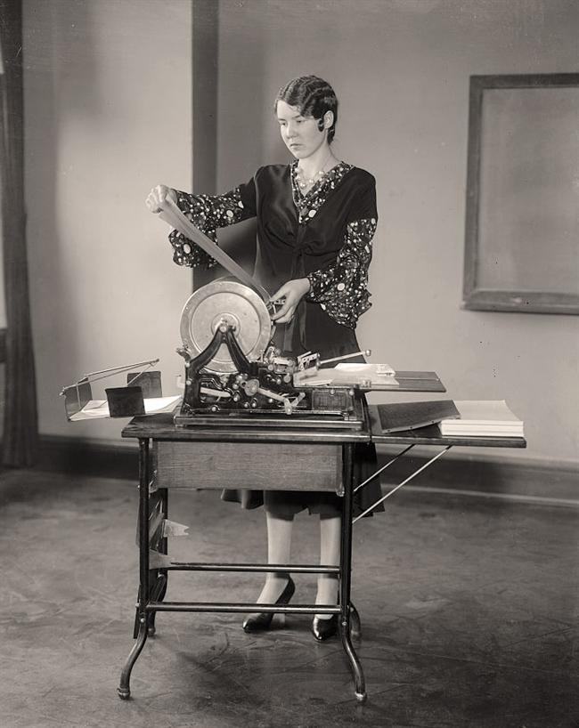
Most interesting of all, though, is that the flyer is cheap.
Printed cheaply, or by hand on machines like mimeographs then, they’re now photocopied. Cheap, ubiquitous, disposable, ephemeral, powerful in their reliably everydayness.
The tourism poster – with its large format, colour, and less localised content, is more expensive. Better for an infrequent event, publicised to a less-local market.
Fascinating, in combination, for the way they illustrate the global/local nature of lindy hop communities. But more interesting for the way lindy hop communities then and now are necessarily highly local. Hyper-local. Delineated by an hour on public transport or in a car. Depicting intensely familiar spaces, names, people, places. The Savoy might be a glorious, nostalgia-laden phantasm from a by-gone age for us now, but then, for the people holding its flyer, it was local community. Everyday. Ordinary. Essential. And anything but ephemeral.


