In the ongoing world of extreme online music nerddom…here‘s the content of a bunch of old edison cylinders.
It’s worth having a listen to.
Category Archives: clicky
probably worse than buttons
Am I the only one who has trouble with the idea of Amish.net?
planet pupulon
In the spirit of all things cute, I give you this comic.
i’ve stumbled into a cute-spiral and can’t get out
I can only attribute it to incipient thesis-completion-madness, but I’m finding these sorts of sites irresistable. No, wait, don’t go look at that site – rush to this site to see a cute kid singing a cute song.
“Some parts of the internet should be nice, for the nice people.”
I’ve stumbled into a cute-spiral and can’t get out.
i just can’t get enough of this

i love those little paws! look at the fur on the bottom of them! look at this little thing!
too much cute

couldn’t you just die?
bunnytown
Recent news:
Last weekend it was 42 during the day on Saturday and Sunday. 24 hours later it was 12 degrees. That’s some crazy, mixed up shit. Ah, Melbourne – every temperature you care to name. In a week.
We nearly expired of the heat over the weekend, and resolutely spent the time indoors. As per usual, I spent the time constructively fiddling with websites.
No, not this one. The new site for MLX6. No, don’t bother looking – it’s not up yet.
It is, however, a spectacularly clever application of Movable Type. Hoorah for powerful, simple ways of publishing. Free and powerful – what could be better. I’m particulary proud of the way I’ve used categories to order my pages, and the seperate ‘entry body’, ‘extended entry’ and ‘title’ fields to organise the data on the page. I am quite the cleverest person I know right now.
Its use of categories means there are only 2 templates to fiddle with. Hoorah – less work!
Its use of Movable type means that updating content on the site will be as easy as accessing the MT editing page, typing in the boxes and hitting ‘save’. Yay! It also means that anyone can update content, so if I suddenly go MIA, someone else can take over – double yay!
We have yet to decide on things like themes for MLX6 (any ideas?), and we haven’t even decided who’s doing what exactly. We have, however, started thinking about an organised approach to PR, and to making contact with our contacts. After last year we have conclusive proof that we are an arse-kicking event management team, that running MLX can be low stress and actually fun, and that this year’s MLX will be fantabulous. My major concerns are, of course, visuals and layouts – a neat logo, a catchy theme, etc etc. The rest of the crew can worry about inconsequentials like bands and DJs and dance floors (though if you can think of any good ones…).
On other fronts, The Squeeze and Crinks have been sending each other photos of insanely cute rodents like this little thing and the ones in the flickr bunny pool (linkage, crinkle?). This is the latest in a torrent of images from places like ratemybunny.com. RMB is one of those stupid voting sites where you rate a picture – could be of a poo, a penis, a face, kittens, puppies, whatever. The bunny site is the best, in part because bunnies are so unusual (to me, anyway), because I’m not allergic to bunnies, and because bunnies have really big ears.
I have a strict bunny-rating criteria: less than 5 for crap quality photos. Less than 3 if there’s a child or person in the photo. Bunnies with ‘up’ ears are likier to score well than ones with ‘down’ ears, though there are exceptions. Dress your bunny up in demeaning human costumes and you score less than 3. Include baby bunny photos and you can add 2 points automatically.
I can happily burn hours (ok, minutes) on RMB: good, clean family fun.
So far as our education flicker fest goes, we had a recent run of rubbish: I found a J-Lo film I hadn’t seen, we saw the Peter Sellers biopic and completely wasted our time with the Ray Charles biopic: it was fucking awful. Tedious! Dull! Dumb! Poorly acted! Unnecessarily wanky editing and camera tricks. Everyone knows that a decent biopic just tells it like it is: if they’re not interesting enough people to make a good story, don’t try to dress it up with fancy camera stuff. From Ray, you’d think the man was dull as dog shit – surely he wasn’t? Oh well.
But tonight it’s Chinatown. More gangstery/noir goodness.
interesting site…
Combining cartography and creative writing, Concrete Dialogues is a
unique project that marks the beginning of a quite different map of
Perth. Online and on paper, some of Perth’s best young writers will
take you on a journey into parts of the city you’ve never known, and
show you some of the memories that shape a place in the eyes of the
people that call it home.
…etc etc etc.
It’s more fun just to read it, though – dialogues.concrete.org.au.
i don’t know why
i don’t know why i don’t just pop her site over there on the side so all (3) of you can go look at her site yourselves. i just can’t stop reading that horrid wench’s blog. it’s just so painful. and while there was Secret Glee in the misfortune of others in my prior readings, now it’s just plain scary. i just don’t understand this chick.
god, i wish she didn’t post so often. then i’d not be tempted to read. urk.
oh, art
two things, really.
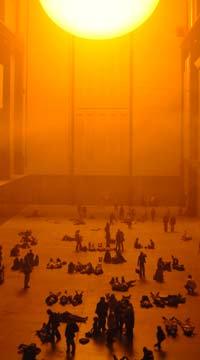
first, they’ve got this interesting exhibition on at the tate modern in london – that picture is taken inside the turbine hall, where “The Weather Project”, by olafur eliasson has proved extra popular with londoners.
basically, they set up that huge space to look like a room with the sun in it. seems brits went nuts over it – just get crazy for the big warm looking ness of it…
the other thing – one of the guys working in the gallery kept a diary in the Guardian, where he talks about the exhibition.
it’s interesting stuff.
i’ve cut-and-pasted the entries into this entry so it doesn’t get lost. but make sure you go to the site – i’m sure i’ve contravened copyright doing this. it’s best to go to the site, really – nicer to read.
i loved the the tate mod. it’s facinating. i love old factories that have been made into public spaces – the power house in bris (look here for a truly horrible website that almost gives you an idea of the thing. goddamn hack IT designer people. or here for a photo by john linkins from the site) is another fave. i was utterly stunned by the tate mod in london – it’s so BIG.
and it sounds like this ‘weather’ exhibition is making interesting use of all that space. and of the brits’ weirdo weather obsession… which can be understood. they don’t see the sun in england, in winter. well, they do a bit, but it’s pale and far away. and not really sunny.

