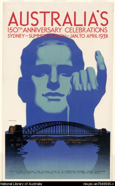
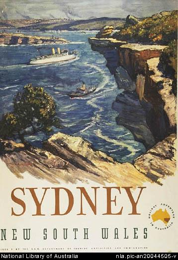
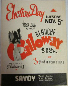
Looking into ideas for promoting events, I began with historical texts, for obvious reasons. I was caught by two examples: tourism posters for Australian cities and playbills/flyers for the Savoy Ballroom.
(1938 150th anniversary poster)
(Trove has a nice collection of these)
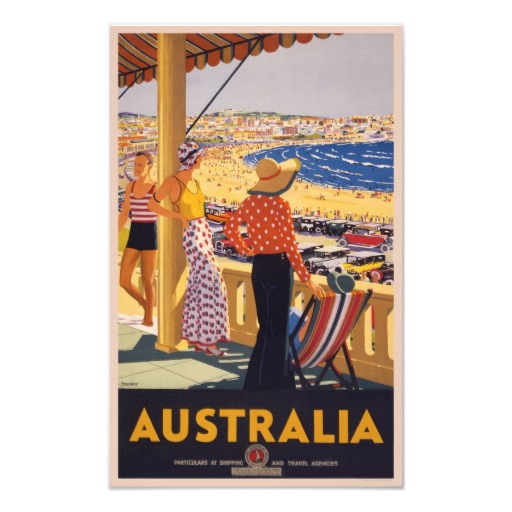
But I found the tourism posters just didn’t work for my project. I was designing a flyer for a local dance, targeting a local market. Tourism posters for Sydney were targeting a national, even international audience. The images of Sydney they offered were too simple: a sun-drenched beach. An art deco drawing of the Harbour Bridge. People who live in Sydney have a much deeper, more nuanced understanding of the city. Their idea of Sydney is far more than the Harbour Bridge or beaches. It’s street corners, shops, the view from a particular hill, the colour of the water near a park, the smell of the alley behind their house, the height of the steps from the train station platform. The tourism posters simply don’t capture that complexity of experience.
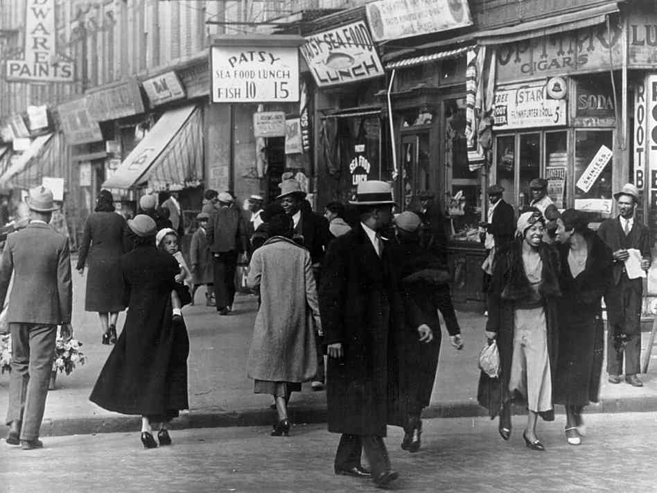
(from the npr site)
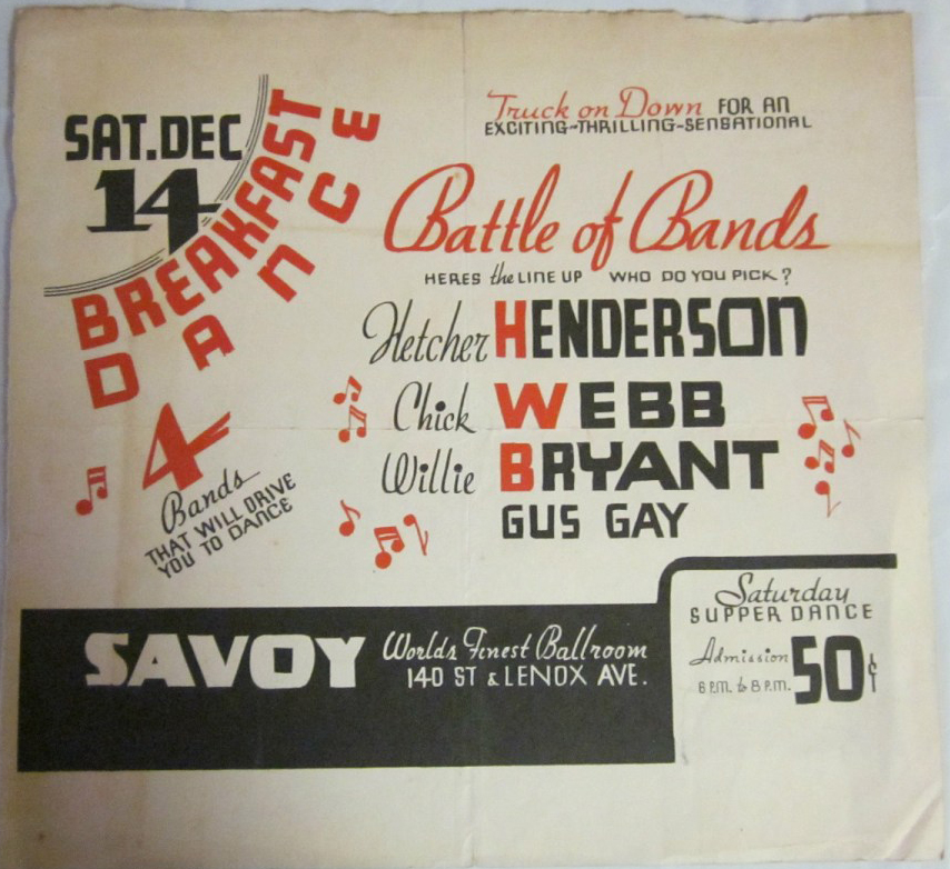
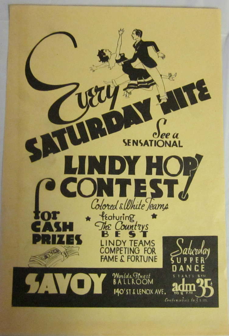
In contrast, the Savoy’s flyers perfectly capture a truly local idea. They’re hyper-local. Designed to be handed out, passed hand-to-hand, they’re designed not just for residents of a city, but for residents of Harlem. Of this part of Harlem. There’s no explanation of ‘Savoy’, or ‘lindy hop’, or of who band leaders are. There’s a great deal of assumed knowledge built into the creation of this text. Readers are positioned in a particular way.
Tourism, posters, in contrast, are introducing an idea of place to the reader. The Savoy’s flyers are using an idea of a place – a community – and expanding it with suggestions about how residents might enrich that understanding. You live in Harlem? Of course you care about dancing!
And an important part of this sense of hyper-local is the up-closeness, the immediacy of the physical object itself. This is a hand bill. A flyer. To be picked up from a table, accepted from a proffered hand. And then it’s folded and put in a pocket or bag. Slid into a newspaper. Tucked into a magazine or book. Scribbled on. Shown to, and passed from, friend to friend. And there are many copies of them.
Tourist posters are posters, displayed on walls. To be looked at, not used and possessed. In a similar way, the Savoy in these flyers is owned and belongs to local Harlem residents, and the Sydney of these posters is inaccessible – to be visited just for a day or week.
Flyers are cheap, one or two colours on cheap, small pieces of paper, mass-produced and replaced by next week’s – tomorrow’s – version.
This is fascinating when you think about how these local texts work in a modern context. While modern lindy hoppers rely on the internet – Faceplant, websites, email – paper flyers are still important promotional tools.
The thought is that you show an audience the image three times – in three different media – and then you have that image stuck in their minds. And paper flyers are found in dance spaces. These are powerful places for dancers, associated with the physicality of dance itself. But paper flyers only really work with the digital repetition. The winning trifecta is a paper flyer and a personal recommendation and a reliable website or email.
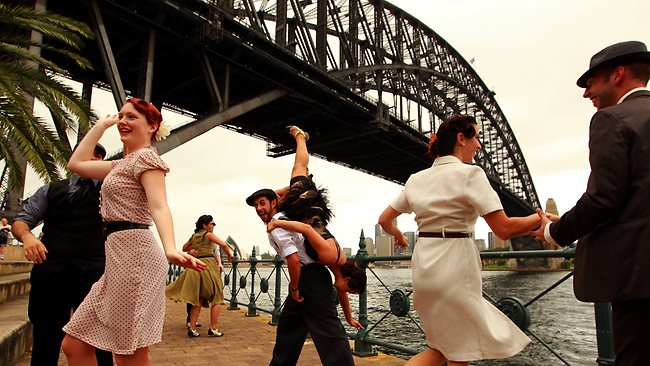
Looking at these two different media, I’m struck by how the Savoy’s flyers are perfect for promoting local dances to dancers. Because that is their purpose. A tourism poster, though, combining (for example), the Harbour Bridge with a dancer would be perfect for advertising a Sydney lindy exchange to interstaters or internationals.
(This photo from the RTA’s Sydney Harbour Bridge 80th birthday event gives us an idea of how this could work)
Most interesting of all, though, is that the flyer is cheap.
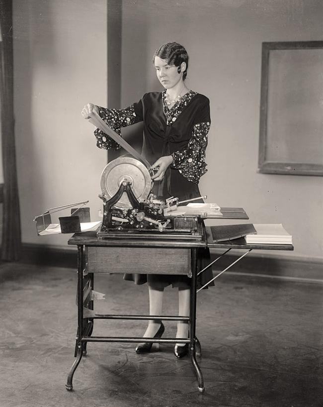
Printed cheaply, or by hand on machines like mimeographs then, they’re now photocopied. Cheap, ubiquitous, disposable, ephemeral, powerful in their reliably everydayness.
The tourism poster – with its large format, colour, and less localised content, is more expensive. Better for an infrequent event, publicised to a less-local market.
Fascinating, in combination, for the way they illustrate the global/local nature of lindy hop communities. But more interesting for the way lindy hop communities then and now are necessarily highly local. Hyper-local. Delineated by an hour on public transport or in a car. Depicting intensely familiar spaces, names, people, places. The Savoy might be a glorious, nostalgia-laden phantasm from a by-gone age for us now, but then, for the people holding its flyer, it was local community. Everyday. Ordinary. Essential. And anything but ephemeral.

interesting thinking. We (Roffaswing, Rotterdam, Netherlands, a newbie scene) do consciously merge the historic local facts/photos with the typical “contemporary-vintage” swing scene style for branding/promotion, it seems to work well.