March 08, 2004
fuss fuss fuss
some things that are annoying me about my site:
- the double spacing in the entries. i don't like the wasted space. waste-not-want-not, i say.
- the big spaces everywhere. perhaps it's an agoraphobia thing. spending 15 years in a hilly city has spoilt me for wide open spaces. they are Not To Be Trusted.
- the way we're reminded at the end of each entry that it was 'posted by dogpossum'. yes, yes. we'd kind of gathered that. perhaps if i was a collective, i'd dig that feature. but i want it GONE.
- the entry pages. because i haven't started looking at that yet.
- the way you're asked if you'd like to 'continue reading "blah blah"'. i think i will make the main title on the index page (for each entry) the link. i am still unsure about whether i should put whole entries on the index page. hmmm....
- the lines. at the end of each day's entries on the index page, between 'comments' and 'post a comment' on the entry pages. what the fukk? redundant, much? sheesh. that will also GO when i get to those pages. in fact, the whole entry page is wrong. just, please, give your attention to content, rather than style...
perhaps.
things i'm not sure about on my site:
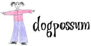
- the main 'dogpossum' title with the little picture (yes, that's me. kinda circa this time last year, but heck, i ain't drawn me in a while. does this make me a badly drawn girl?... sorry) should this be flush to the left? centred?
things i want to add to my site:- little 'i'm reading'/'i'm watching'/'i'm listening to' bit on the index page. though i'm not sure i should clutter it up. i'm kind of torn - clutter or clean lines? i like both.
Posted by Dogpossum on March 8, 2004 05:55 PM